Map Controls
Product UX/UI Design Lead
Company: Seerist
In Collaboration with: Product Managers, Head of User Experience, Chief Technology Officer, Development Team

Context
The Seerist platform's map was inconsistently integrated, with its controls sometimes hidden by panels that either interacted with or ignored the map. This inconsistency caused user confusion and obscured key workflows, reducing overall usability. To address this, I proposed multiple redesign options and collaborated closely with the Product Manager to resolve the issues, clarify the map's role, and improve interactions. Our goal was to create a seamless content journey that maximized data value and enhanced storytelling by harmonizing map presentation with the user experience.
Context from Product Manager
The Seerist Platform has an underlying Map that remains present across the platform, but is sometimes hidden or partially hidden by various panels and components. Some of these panels and components contain features that affect the map (plotting content and data) on the map, and some of them don't. This is currently done inconsistently and can cause confusion about the role of the map, and methods of controlling the map.
We aim to use the map as part of the content journey by using the map to tell a story with our content and data. The end goal is not simply to place information on a map, but instead to leverage the map to maximise the value of our data to the user. We will clarify the role of the map, improve the user’s interactions with the map and provide a clearer, more harmonious way of presenting content and data on the map.
Challenges
Addressing Design Inconsistencies
Challenge: The product exhibited inconsistencies in iconography and language, resulting in user confusion.
Solution: I conducted a detailed UX heuristic audit and developed guidelines to standardize usage across the platform. I also worked closely with the Product Manager to implement these changes, improving design coherence and delivering a more unified and refined user experience.
Handling Delayed Feedback
Challenge: Feedback was frequently delayed, leading to project delays and the need for restarts either months later or right before deployment deadlines.
Solution: I collaborated closely with the Product Manager and Head of User Experience to establish a streamlined design process. I also demonstrated flexibility by providing alternative design solutions under tight deadlines to keep the project on track.
Improving Color Utilization for Navigation
Challenge: The existing product lacked a strategic use of color to enhance user navigation.
Solution: I implemented Seerist's primary Kelly Green for key navigation elements and feedback indicators. I conducted internal reviews and gathered user feedback to refine the color application, ensuring it improved navigation clarity while maintaining a balanced, non-overwhelming interface.
User Personas
To address low usability issues in the Seerist platform, I developed detailed User Personas for its two primary user types - Analyst and Security Manager (Federal) - based on insights from user testing, feedback, and stakeholder input. These personas were used to inform design solutions, ensuring the user experience was tailored to meet the distinct needs of each group.


UX Heuristic Evaluation
Screenshots from Existing Seerist Platform
The current platform was designed by developers. Design inconsistencies and the lack of adherence to Usability Heuristics cause user confusion.

Map Overlays: The Map Overlay was selected in the Risk and Stability screen, but when the user is in the Search screen, there is no information on what Map Overlay is being used (Political Risk Overview with only High and Extreme Risks selected) or where to change it.

Map Icons: The Map Icons displayed here were saved from the user’s Search of All Events for the month of November 2023, but in the Risk and Stability screen, there is no feedback to the user to give context to the date selection or legend to the iconography. The iconography legend is located (hidden) within the Search screen.

Hidden Filters: The ability for the user to show icons on the Map for Influences is within the Influences screen. A navigation item has been given to this feature, but the only feature on the screen is to add these Influence icons to the Map. Once the user is in an alternate screen of Seerist, they will still view the Influence icons, but there will be no legend for the user, and no information to the user on where they can turn these Map Icons off.

Map Icon and Feedback Confusion: Here there is a plane icon on the Map, but this plane icon was turned on in a different section of Seerist. Because there is no legend feedback to the user, the user doesn’t know that this plane icon represents the user’s personal Asset Type for their “Main Locations,” so when they turn on “International Airports” within Places, they could think that this plane icon represents “International Airports.” Also, the feedback to the user of their selection of “International Airports” is so subtle, it could cause confusion on what Places are selected.

Map Design Inconsistency: Some screens in Seerist have a Map, but do not correlate to the screen content, such as the Global Issues Dashboard. This creates a confusing user experience as the user tries to learn the product and Map interactions. On the Global Issues Dashboard, the user could wonder what the Map Overlay is of: not only what the colors represent, but what each color signifies.

Brand Coloring Inconsistency: All of these screenshots of Map Overlays in this section supposedly represent Political Risk, but you’ll notice that across the platform, the Map Overlay colors vary by screen, which causes further confusion for user learnability. Also, these colors are not in line with the marketing brand guidelines.
Requirements from Product Manager
Intro & Scope
In this story, we focus on the placement and general elements of the Map Controls panel. In other stories we go into specifics on how each feature within the menu works.
Map Controls is a key new menu item which allows users to understand and manage what is being displayed on the map, from within a single consolidated menu on the map.
This solves for the issue of the controls for content being displayed on the map, being disparate and spread across Seerist, preventing users from being able to effectively understand and manage what is being displayed on the map.
Requirements
Transition all map menu items to right side of map
Add ‘Map Controls’ icon to map
Apply simplicity and color consistency
When user presses ‘Map Controls’ menu icon, Map Controls panel opens on right hand side of map
Map Controls will then slide in to sit above any other panel shown on the right hand side
When user closes Map Controls closes, it should reveal any previously open right hand panel
Map Controls is only accessible from the map
Users have a master control to show or hide ‘Points' and ‘Layers’ on the map
This shows/hides all content types/data within ‘Points’ / ‘Layers’
This does not affect any specifications users have made regarding content visualisation within ‘Points’ and ‘Layers’ but instead shows/hides currently active content within the group overall
Within the ‘Layers’ section there is a ‘Opacity’ slider control allow users to control the layer opacity for any selected layer
This affects all content types within ‘Layers’
can match the implementation of the same control within Risk & Stability
Move Base Layers to within Map Controls menu
When a panel is opened from the left hand side, that is going to overlap with Map Controls, Map Controls should close to make space for the left hand panel
Panels opened from the left hand menu that do not overlap with Map Controls, do not need to close Map Controls
For example, Search can be seen and user simultaneously to Map Controls if user wishes
Ensure Map Controls updates to align with controls over the map elsewhere in Seerist
Existing Problem
We should try to also free up map room (common practice in mapping) and not take up lots of area on a map unless a user opens a menu. This was a big issue within Seerist Core where the menus took up 30-40% of the map screen without a user interacting with them.
User Story
As a: Regional Security Analyst
I want to: have access to consolidated controls for the map visualizations of all Seerist content and data types, in a single Map Controls menu.
So that I can: harmoniously visualize a blend of Seerist content on the map, gaining the cumulative insights I need from the different types of information I can blend together to understand what ia going on around My Assets.
Use Cases for Map Controls:
User wants to use the map to tell the story of their asset/assets using the Assets Page. They will start their journey within the Assets Dash, and progress onto the map. Once on the map, they will view the content placed on the map by the Asset Dash, but then use Map Controls to add/remove content based on need.
User wants to use map to tell the story of Risk Ratings (RR). They will start their journey in the RR page and then progress to the map using the Map link from the RR page. Once on the map and viewing RR content, they will then use the Map Controls to add/remove further elements from the map to continue their content journey and discovery.
User starts with Map from scratch (Map is blank) and then uses Map Controls to build up the map and explore content around the world. From here, they may then progress on specific content journeys that might take them away from the map, into dedicated content panels, and then perhaps back to the map.
I think these 3 use cases are the clearest we can work with right now until we clarify the map positioning better. Ultimately, the map should be a tool that users CAN use to better understand the content that we are presenting to them. It should be woven into the structure of the site in a way that allows users to progress on a narrative, not locks them into a dead end flow.
First Iteration: Initial Conceptual Sketches
Context from Product Manager
We need to integrate Map Controls with the existing content controls throughout the platform, in particular our new Risk & Stability work should be tightly integrated to Map Controls.
Implementation
Here I provide three design solution options. To align with the requirements from both Product Managers, I pull elements and interactions from our other projects into the wireframes to test our conceptual work across the platform.

Design Option One
This design, which provides a static Map Controls feedback bar across platform (on all screens containing a Map, would provide feedback to the user on which Map features are enabled at a quick glance (user wouldn’t need to find and click into a panel to access feedback), so no matter what page the user is on within the product, they know what filters are saved/persist. This feature would allow the user to control the Map from any screen by opening the Map Controls panel by selecting the up arrow located in the right side of the Map Controls feedback bar.
Feedback from Product Manager:
I really like the feedback bar along the bottom of the map showing me what I am viewing on the map. IMO it could be smaller, with icons to show data types, but with an expandable view perhaps. I think at the moment it's a little too big?

Design Option Two
Provided here is the ability to allow the user to expose or collapse the panels they want to view over the Map. The user has the ability to expand panels for more information relevant to them, and to collapse panels when they need to explore more of the Map.

Design Option Three (Map Controls Widget Collapsed)
The Product Manage preferred a design where the user can locate the Map Controls panel within an icon on the Map (bottom right). Because this had the lowest usability for the user, I provided the alternate design solutions Option One and Option Two above.
Because Seerist has left and right side panels, I proposed a concept where all information panels could be located on the left, so that when Map Controls panel is opened on the right, it would not hide any other panels. To merge all information panels, I proposed a top tab navigation solution for the user to hop between such panel information as My Assets, Risk Ratings, and Hotspots.

Design Option Three (Map Controls Widget Expanded)
The Map Controls panel could be exposed on the right by clicking on the bottom right map icon, and could be minimized to view more of the Map and it’s content by clicking on the down arrow within the top right of the Map Controls panel.
First Iteration of Map Controls Component Design
Proposed a feature solution within Map Controls panel that gives feedback on what has been selected, such as only Headquarters within the My Asset types dropdown. This feedback chip would have a close icon, so the user could quickly turn off this selection without needing to click into the My Assets dropdown. Also put in a Clear Filters button at the top that allows the user to clear all selections quickly.
Feedback from Product Manager:
This is absolutely brilliant! Exactly the right direction and I LOVE the integration of Map Controls with the other panels and content!
Feedback to user that Risk Rating and Pulse can’t be on at the same time.
In the current platform implementation, it is not currently clear where our users' journey with the Map starts. This is not necessarily a good or bad thing. We are not saying "you need to start with the map here", but instead we are saying "you can use the map here to tell a story, and this can flow through to points X, Y and Z if you want." We need to consider this concept of how the map is weaved into the structure of the platform. This will be significantly related to our work on overhauling the UI and overall nav.
What are our Map defaults, depending on where we come from?
As a general concept we need to clarify the relationship between the right hand widget bars and the map as the relationship between the two elements isn't clear. I know that's part of our mission with our work on Map Controls but I think this mission won't be complete until we fundamentally work reshape the platform so it has a more logical interaction between content pages and the Map.
I think the Map Controls themselves are brilliant. Now we need to think through how the content is visualized on the map interplays with content in the panels.
Are there blanket defaults on the Map or does it depend on where the user is coming from?
User Experience Initial Proposed Solution
Intention for Map defaults is that a user can access a blank Map from Map in left side navigation, but if they are using a Map within a separate section of the left side navigation, such as Risk and Stability, the Map defaults to having this relevant Risk Rating turned on in Map Controls. This implementation had more complex resulting issues.
User Experience Problem
A resulting issue would be: which filters would we save of the user’s applied filters, and which would we change to the new screen's default (default application of Risk and Stability to the Map in Risk and Stability). I think we can scrap the "save" when a user changes screens (alternate navigation item), as they are changing workflows, and only "save" filters on specific screens (save any filters they set on RR for when they return to RR). In either option for the product saving a user’s filters, this could cause confusion to users, since we aren't providing a feedback bar to the user on which Map Controls are on.
User Experience Proposed Solution
Since time was not allowed to conduct User Testing, I proposed this solution in the meantime: Allow the user’s applied filters to save within a specific item of navigation, such as Risk Ratings, but not have that set of filters persist when a user changes workflows by navigating away to another item in left side navigation. If the user returns to Risk Ratings, their previous filters would have saved and appear.
Response from Product Manager
I think it's okay for the Map to retain the last set of configs that the user selected, either via their:
Interactions with 'Map Controls'
Interactions with content such as the Assets panel
I think we can have a 'Clear Map' function somewhere on the Map which allows the user to wipe the map. This will give the user control over the map. I think by default the Map should generally be blank and have things added to it by a user's interaction with either content or Map Controls. This will solve the issue of everything being plotted on the map by default, causing information overload. Since we have no clear structure of how the Map currently interacts with a user's journey, it's really difficult to answer what should default onto the Map and when.
Second Iteration

Feedback from Product Manager
As part of our Map Controls work we need to determine how user interacts with points on the map and what those behaviours look like. For example to the UX Manager’s point - what does the transition look like if I move from one Asset to another? We need to run through each of the pieces of map data/content and define what the interactions and transitions are for each of those data types. For example, what happens when I click on a hotspot icon?

Design Solution Response
When the user selects a specific Asset icon (here Lagos HQ), the Map zooms in to this Asset. To correspond this work with our Asset (and Asset on Map) work, I correlated the left content widget to the conceptual widget for Asset on Map. This would imply then some design tweaks to the left side content widget to provide design consistency across platform, but feedback was soon received on change in direction.

Design Solution Response
When the user selects a specific Hotspot icon (here in Nigeria), the relevant card is selected for the user to read. For higher usability, the card and map icon are highlighted in green to give feedback to the user of their selection and correlating Hotspot card for the user to read more information.

Implementation of Feedback from Product Manager
Because Map Controls widget and Map interactions controlled not only the Map, but also the content widget, I suggested that it could make more sense that the Map Controls widget was on the left, and the content widget on the right to reduce user confusion.
Response from Product Manager
The Product Manager decided that the interaction would be that the Map Controls and content widgets are both placed on the right, so that only one could be accessed at a time.
Response from Stakeholders
Stakeholders found this confusing, so eventually, it was decided that users could only access the Map Controls widget within a designated Map within navigation, and not on every screen that contained a Map.

Measurement Tool
Product wanted to implement a Measure Distance tool into the Map, so the Product Manager tasked me with creating a design for this feature during the course of this project.
Feedback from Chief Technology Officer:
Doesn’t want to be a click in to turn on, wants on top collapsed view.
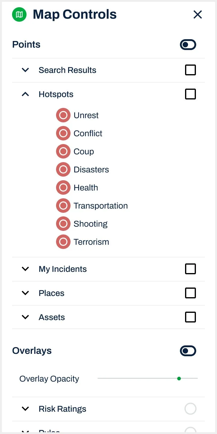
Group under from Map perspective.: The Chief Technology Officer wanted the Map Control contents to be reorganized into Points, Overlays, and Map Base Layer. Users need to organize this way because when turn one on, other turns off.
Search Results: would be a layer on Map itself, so can’t apply filters, but could allow to overlay Map. Allow user to turn on or off Search Results in Map Controls. Likes having a legend in here, but wants to keep simple. Can’t see Search Results because Assets is on.
Feedback from Head of Development:
Clustering is an issue is hiding data. Solving clustering could solve layer ordering.
More give user, more they want. Keep simple so easy to load map.
Feedback from Head of Product:
Add Incidents to Map Controls.
Include Power Outage and Weather for MVP.
Need to figure out where map controls are (right or left -> i think it should be on the right but i am open)
What is the interaction of the Map as a menu item on the LH menu vs on the map
Controls should also include the layers and add the measuring tool + polygon drawing in future
Ability to turn full layers on and off without having to go into the menu
Hierarchy of the layers: show what is off and what is on -> if RR on Pulse is off. maybe go back to the original mockups where we showed layers vs markers and we can decide what to call them after?
Make sure the icons are always included
Feedback from Chief Product Officer:
Search is full screen. Map is only certain point, might not be relevant for Search to be in Map Controls.
Third Iteration

When the user accessing Map Controls within a certain left side navigation item, such as Assets, that item is turned on by default in the Map Controls panel. When a right side widget is opened, the bar of map icon features that was aligned to the right of screen moves with the widget for user access.

The Product Manager wanted the Map Controls panel to slide in from the right, which would cover any right side information panels, such as the Lagos HQ Proximity. We give the user the ability to close this Map Control panel, when they want to return to the right side information panel.
User Experience Concern
I communicated concern for user confusion around hiding panels and finding panels.

Because Seerist has so many Point icons and Overlays, each dropdown features a Map Legend for the user. This solves for the issue currently in Seerist where there is no feedback to the user on what is selected and what the icons mean for what they have selected.
Feedback from Chief Technology Officer and Development Team
How will user know where to access Hotspots AI if removing from left side navigation? How will user know where to access Pulse if removing from Risk and Stability in left side navigation?
Allowing the Map functions icon bar to move as widgets are opened is a big lift. Do stakeholders want to spend development time on this, or find a less time-consuming, alternate solution?
Feedback from Head of User Experience
This placement of Map Controls on the right creates a negative user experience and I think this prototype showcases why. When the map panel sits on the right, it covers up the [right side panel of] information the user specifically chose to look at. The very thing they clicked on and are trying to get insights about. I feel that this makes it difficult for users to do their own analysis because the UI is literally getting in their way, not enabling them to make informed decisions. These same problems continue in search where there isn’t enough screen real estate to see the map, search results, and use the panel at the same time.
Response from Product Manager
This is an important debate, and one we've spent a lot of time discussing. I think there is a trade off here, as if Map Controls sits on the left, users will not be able to use it while they are using [left side panels] Search, Risk & Stability and other components. I believe this is something that users will wish to do. With the Map Controls on the right, you are correct in that it can sit on top of information panels such as the Asset Proximity Report (once implemented), but I don't believe this will cause the user much inconvenience. I don't expect users to simultaneously be using Map Controls AND viewing specific map content, such as information on a Hotspot.
Solution
If developers are able to implement Map into the left side navigation, it will solve for the user now being able to intuitively access Hotspots AI and Pulse, and would fulfill the Head of User Experience’s concept.
Final Iteration for MVP

Map Controls Dashboard

Clustering
There was an issue in the product with not having a design solution for event clustering on the Map, so the Product Manager also tasked me with creating a design solution for Clustering. I created a larger icon and enclosed the number of events within the cluster.
The stakeholders wanted the final design solution to be that the left side navigation merged all Map Control items into one labeled Map Controls. The left side Map Control widget would hide the Map functions icon bar from users. With this design, the Product Manager’s concept of allowing the user to access the Map Controls widget on any screen displaying a Map was scrapped: the user could only access Map Controls from the left side navigation.
Feedback from UX/UI and Product Design Lead
I communicated my concern for hiding the Map function icon bar from users behind the Map Controls widget, as it was not intuitive for users on how to access key Map features, such as Zoom. If the user did figure out to close the Map Controls panel to access the Map features, there was no intuitive way for them to understand how to reopen the Map Controls panel.
Progression of Component Design

Iteration One
Feedback from Product Manager
Thinking about linking content more directly with Map Controls - what do you think of allowing user to expand each Asset Category within the list in Map Controls, to show the list of actual assets within that category. User can then turn on/off specific assets if they want to. We could link this with the Assets Page so that the two are well linked up.
Remove Power Outage and Weather for MVP
Add a dropdown to each Asset Type to list all user Assets within
Feedback from Second Product Manager
Add eye icon on main categories instead of toggles, and use toggles on subcategories only.

Iteration Two
Feedback from Head of Product
Include Power Outage and Weather.
Feedback from Head of Development
Doesn’t agree with Dashboard icons (for My Assets and Risk Ratings) within Map Controls because users can access the dashboards in navigation.

Iteration Three
Feedback from Chief of Technology and Head of Development
Both wanted to gather all Map function icons into Map Controls, so there aren’t separate corners of icons on the Map.

Iteration Four
Implementation
A bar for Map functions was placed at the top of Map Controls for Find Location, Measure Distance, and Zoom.
Feedback from Development
This feature was later removed based on Development team feedback.